The Value of Animation
Animation in DQM
In DQM ‘evolution’, points move ‘downhill’ in a high-dimensional landscape defined by the data, where regions of higher data density are lower in the landscape. The resulting animation can be viewed in a 2D or 3D plot. (The trajectories can also be analyzed numerically, of course, as needed.)
The animated DQM evolution will often be occurring in more dimensions than the plot can show, and so the high-dimensional motion of points in the 2D/3D plot may look strange or counterintuitive. But this strange behavior is exactly the value that the animated evolution is providing: high-dimensional motion of the points, viewed in only 2 or 3 of those dimensions, conveys information about the data landscape from all dimensions.
The example below is designed to illustrate this idea as simply as possible.
Note: in other contexts, many animated data visualizations will use one of the data dimensions as ‘time’ in the animation. For DQM, this is not the case. The ‘time’ in DQM evolution reflects the process of data points moving downhill in a landscape, and is not connected to any individual data dimension.
Example: Using Animation to see 3D in 2D
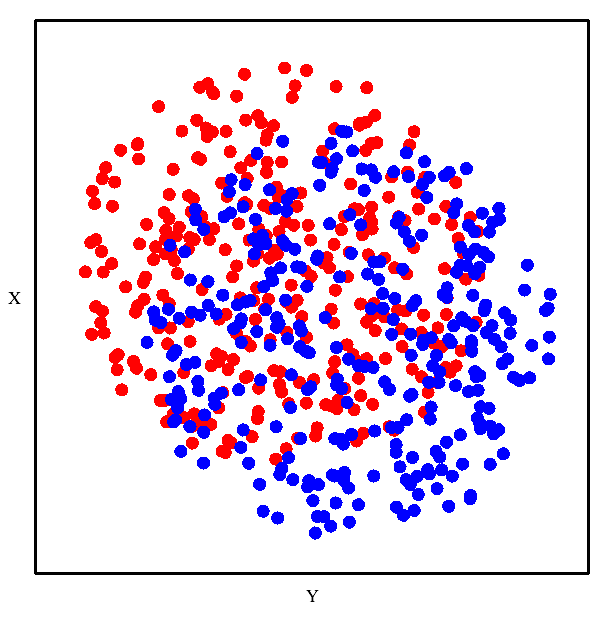
Colors Don’t Look Separable in 2D
From this 2D plot, it would seem that these red and blue points will not be separable.
DQM Separates Colors in 2D
However, DQM evolution shows that they are separable. It looks like magic!

Seeing the 3D Plot Explains the ‘Magic’
When we show the same plot from a different angle, where we can see the 3rd dimension of the data space, the motion of the points in the DQM evolution now makes intuitive sense.

Analogy to Higher Dimensions
By analogy, even though our imaginations fail us in higher dimensions… When dealing with a DQM evolution in higher dimensions (more than 3), an animated plot in 3 dimensions can convey information from more than 3 dimensions about the structure of the data landscape.